
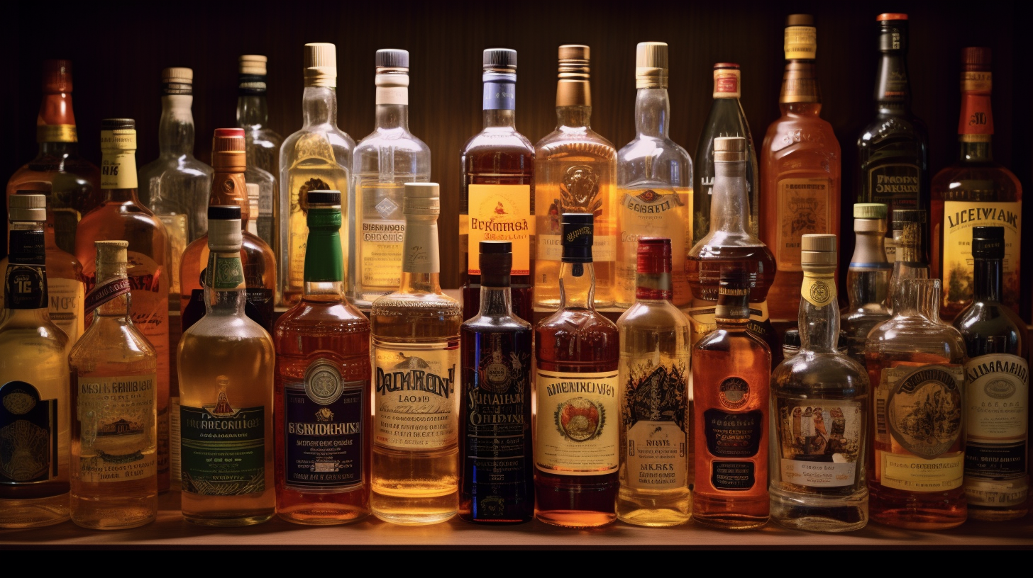
In a crowded marketplace, it is more important than ever to make your product stand out. And one of the most important ways to do that is through label design. The right label can communicate what makes your spirits special and persuade potential customers to give them a try. Here are a few tips on how to use label design to make your spirits stand out on the shelf.
1. Keep it Simple
When it comes to label design, less is often more. A busy or cluttered label can be off-putting to potential customers. Stick to a simple color scheme and font, and use negative space to your advantage. And don't forget, the back of the bottle is fair game, too! Use it to tell your brand's story in a way that complements your front label.
2. Make It readable
Your label should be easy to read from a distance. That means using a font that is clear and legible, as well as large enough to catch the eye of someone browsing the shelves. Avoid using all capital letters, as they can be harder to read. And when it comes to colors, contrast is key—just make sure not to sacrifice brand coherence in the process.
3. Be Bold
In a sea of labels, you want yours to be the one that stands out. So go ahead and experiment with different shapes, sizes, and materials. But always keep in mind that your label should remain true to your brand's identity. After all, you want potential customers to remember your spirits—not just your label!
With these tips in mind, you're well on your way to creating a label that will make your spirits stand out from the rest. Just remember to keep it simple, readable, and bold—and most importantly, true to your brand's identity. With a little bit of effort, you'll be sure to turn heads—and boost sales!